monthly retrospective: september mail club letter
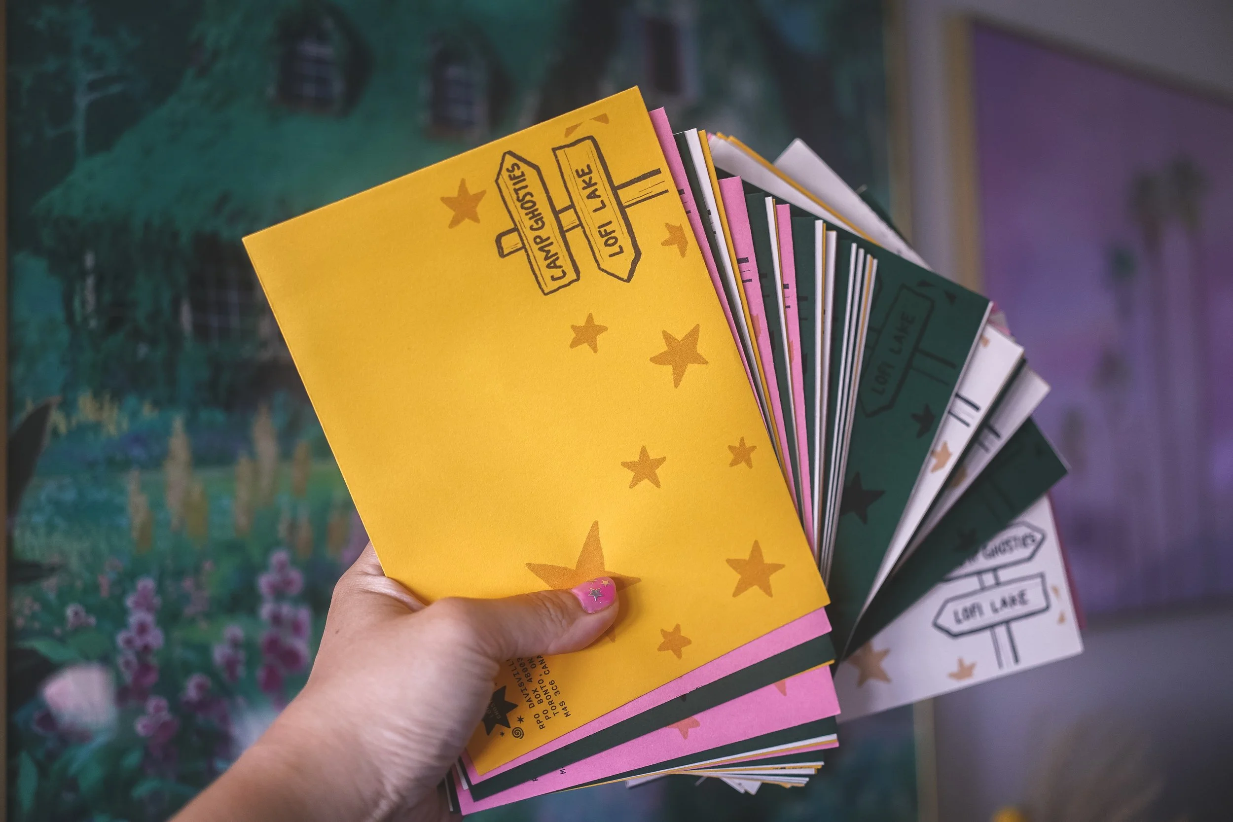
hi friends~
and just like that, september has breezed on by and we’re now officially in autumn/fall season!
hopefully by now, you’ve received your september letters (if you still haven’t, please email me!). now that all the letters are sent out, it’s time for another monthly retrospective.
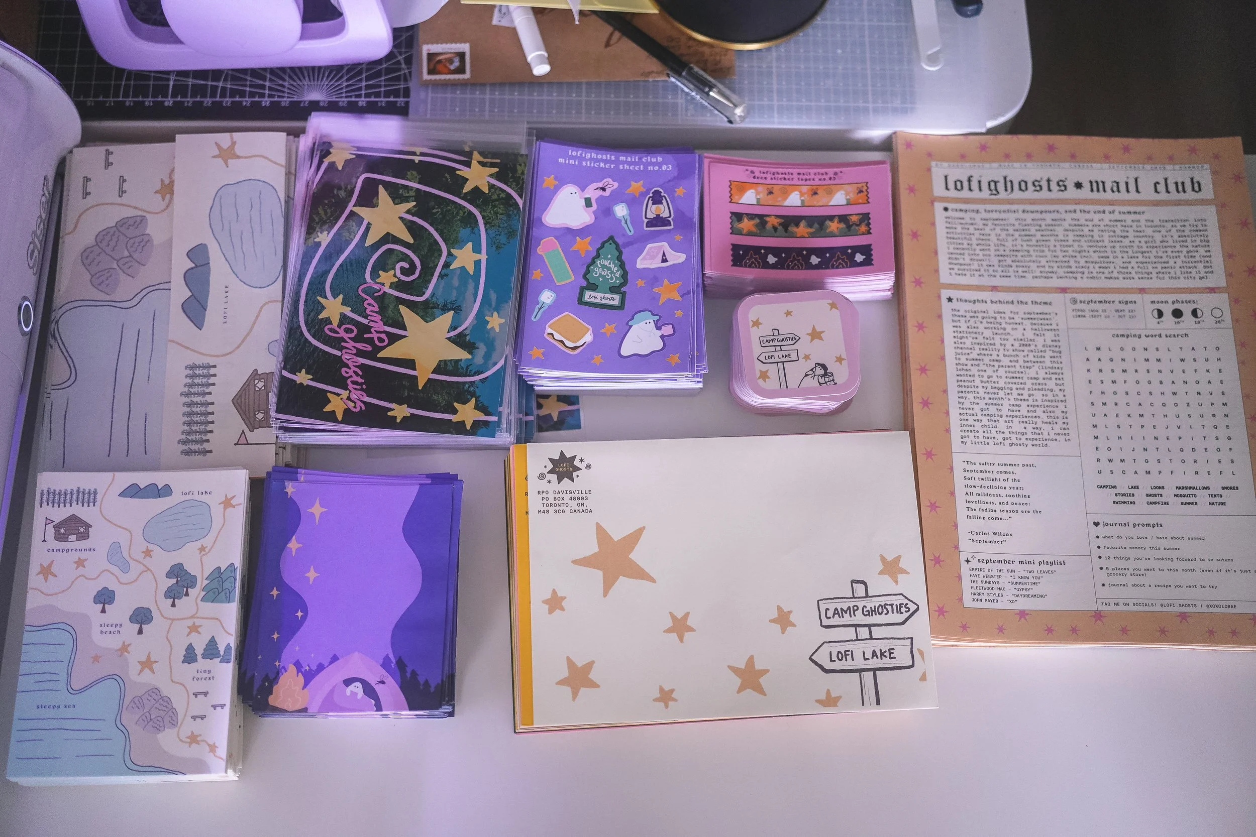
september’s theme was all about camping and summer camp. i never got to do either of those things as a kid, but being able to do them as an adult somehow feels nostalgic for me. i guess it’s because a lot of kids shows and movies from the 90s featured references to camping in the summer. i wouldn’t say that i love camping, but i’m glad i get to experience it. if anything, there’s such a calming beauty being able to experience nature, being less connected online, and just enjoying your time alone or with loved ones without distraction.
for me, a big part of the curating process for the mail club is choosing the right colors. i wanted the theme to feel summery but also lofi-ghosty ya know? it needed to be pink. it needed to be pastel. but it also wanted to feel like summer or at least the end of summer. and if i don’t say so myself, i think the colors were sort of perfect for the month. when i think of september, i definitely think of the end of summer, the twilight of summer. and the color palettes here were trying to reflect both the sunny days and the dusky summer nights. i really loved how all the everything came together for this month and i hope you all did too!
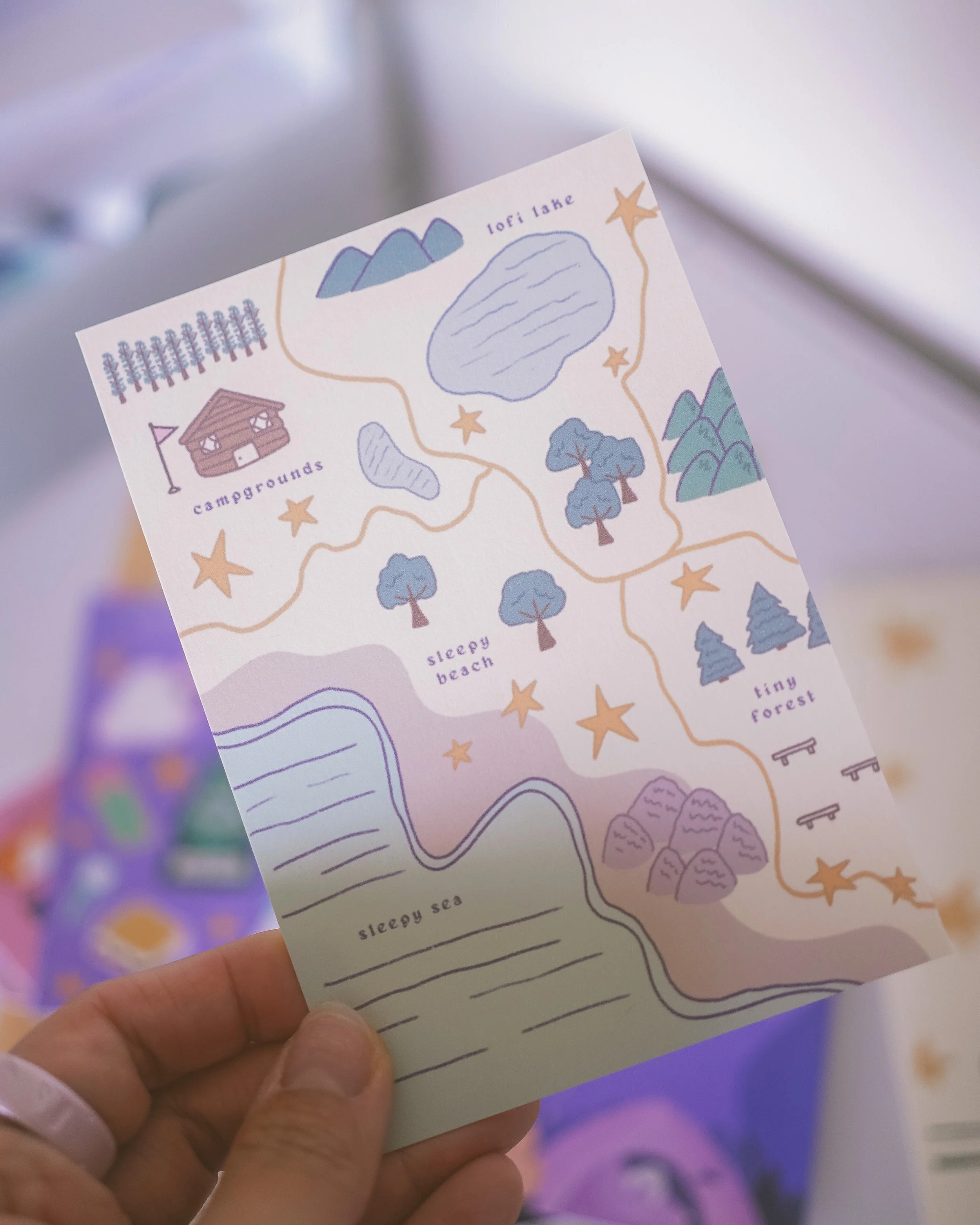
my personal fav piece for this month was the mini map print
initially i made the mini map print as part of the newsletter design. i thought it would be cool to unfold the newsletter and see the map on the backside, similarly to how paper maps work (and i do love a good paper map!). but i quickly realized after gathering some feedback, that many people prefer the smaller newsletters from previous months, as it was easier to stick into various journal sizes. my thought was that the newsletter would be bigger moving forward, as it would allow me to add more fun things into the letters. but i think if i want to make the newsletter longer, it needs to be a separate letter of its own.
part of the reason why i started a stationery mail club was because i had the journaling community in mind. this is why it’s so nice to get feedback from people in the community. at the end of the day, i don’t want my letters to just collect dust and take up space in your drawers. i ideally want all the pieces to be usable in your notebooks. and ultimately, although the idea was there for a bigger newsletter, if most of them will just be sitting in folders or thrown away, i would rather go back to reducing the size so that they feel like usable ephemera. so to everyone who gave me feedback on the newsletters, i appreciate you!
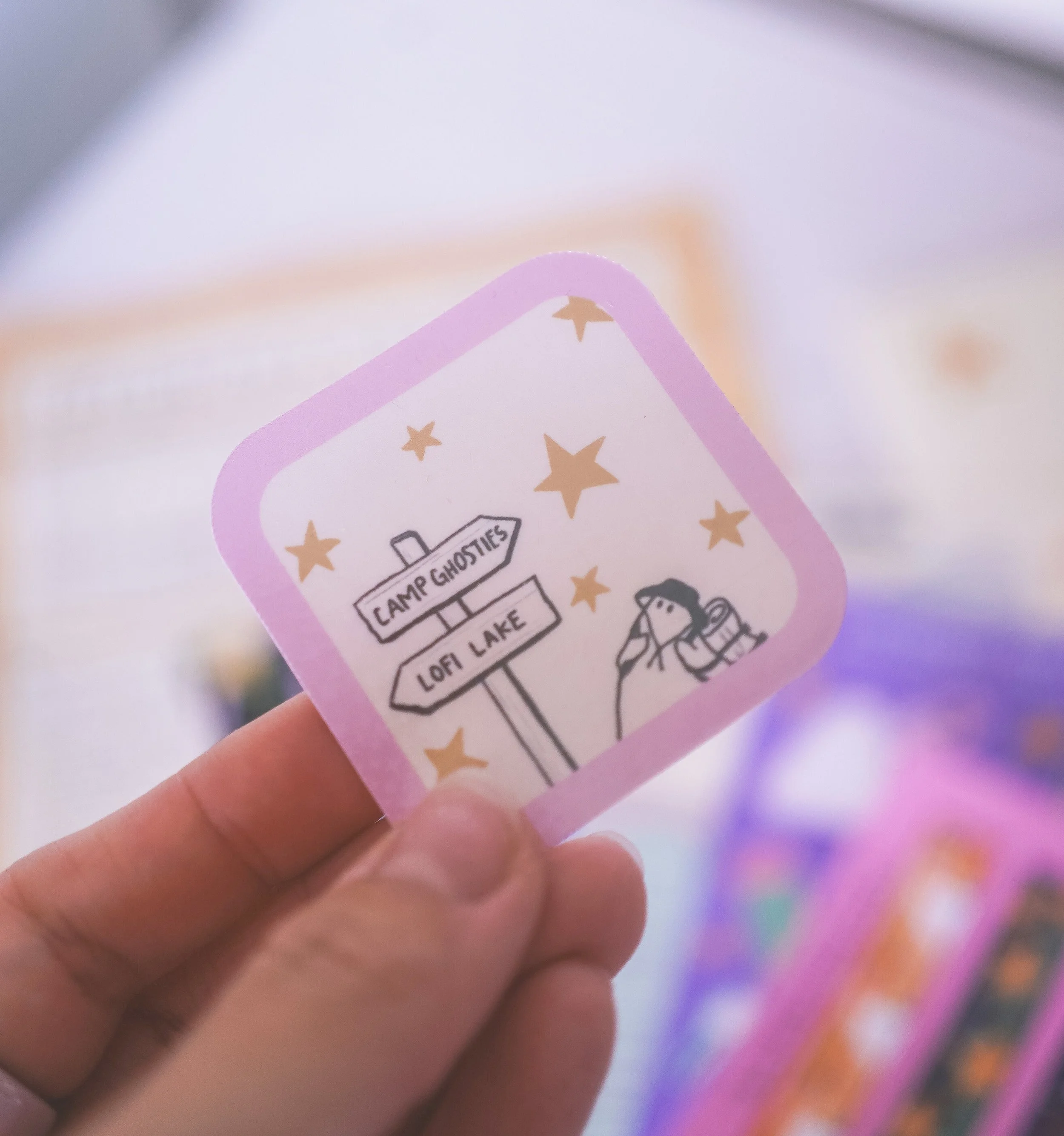
the die-cut sticker for september was this little badge sticker featuring a camping ghost! the little hat kills me. he’s just a lost little guy looking for his campground. we love camping ghosty! let’s hope he found his way eventually (i imagine the ghosty to be any lost letters trying to find its way to your mailbox…)
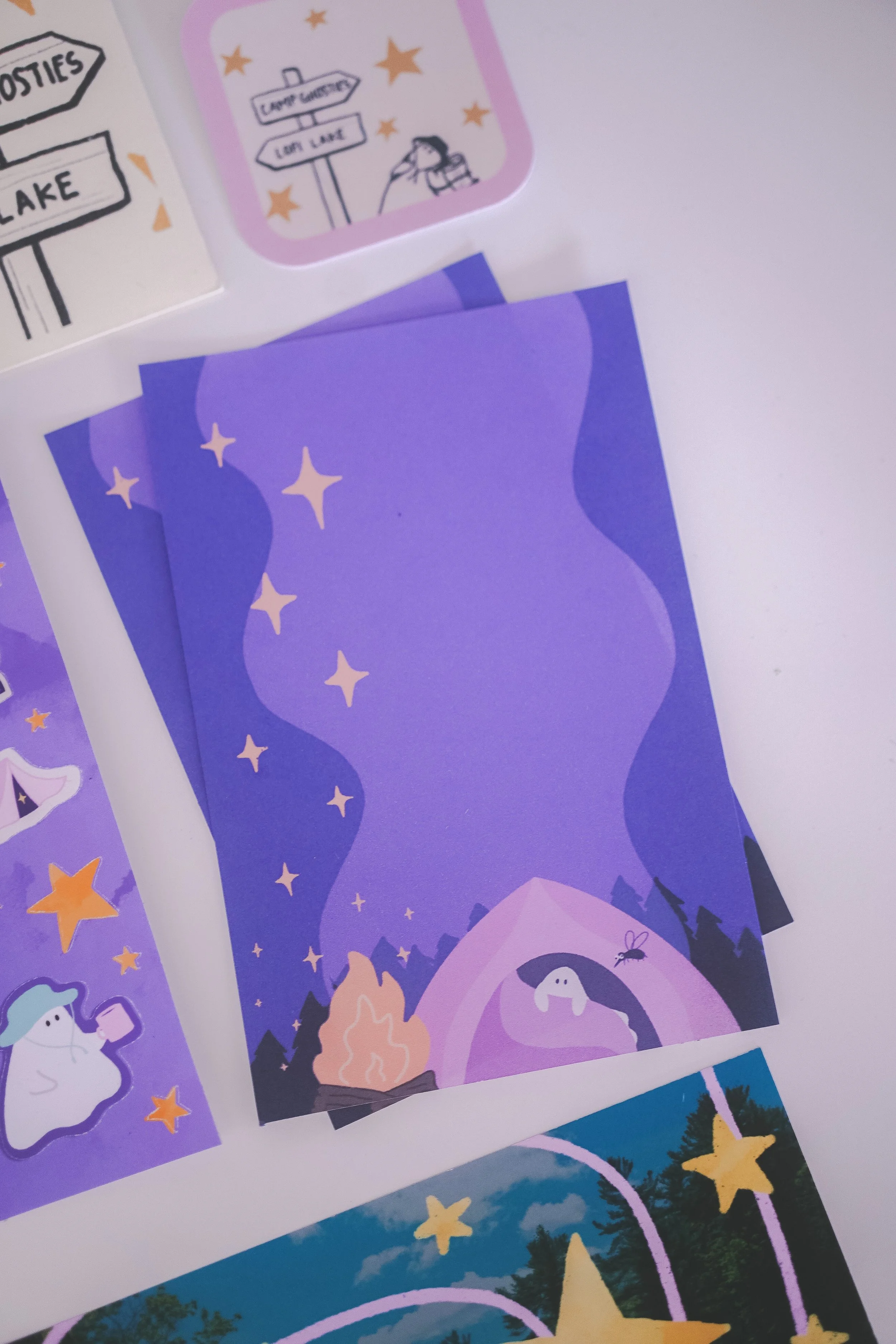
this is probably my favorite notepad design that i’ve made so far! i just really loved how the colors came out here. but i’ll be honest, i still haven’t exactly nailed my process with making these. for september, i decided to add two sheets, but it ended up sort of being a disaster because i was constantly running out of paper. it also just ended up not being sustainable in the long run, as i’d have to cut back something else in order to add two sheets for future letters. the other option that i had tried was making the notepads really tiny, like two mini ones. but then i felt like, what was the point of that if they’re so small you can barely write on them? and unlike a tiny post-it note, the design is somewhat large and gets in the way from writing on it.
the other issue i ran into was saturation of ink onto regular paper. because there was so much color added to each of these, the papers would start to curl. so i experimented with different printer settings and papers that could work the best with so much color, while still being within my budget to produce. needless to say, it was a lot of trial and error and still continues to be an experimental process.
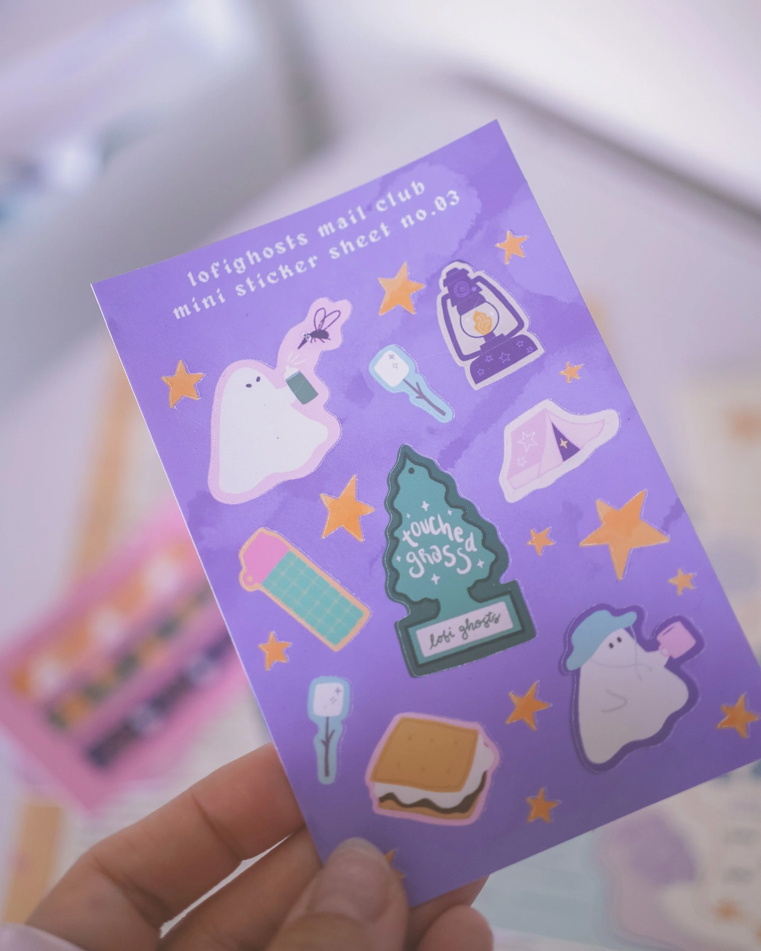
i had so much fun bringing back character sticker sheets! with the sticker sheet, i try to switch things up month to month so it doesn’t feel redundant. with this one, i really had fun doing the full camping theme and could not pass on an opportunity to draw a pissed off ghosty and her arch nemesis, mosquito. one of the best things about being able to make stickers at home, is that i can really make every component of the sheet a sticker. so all the little yellow stars were also stickers.
okay so the bad part of making stickers at home — i messed up. a lot.
i haven’t nailed down this part of the process either but somehow, this was the worst mess-up so far. i managed to print and cut out 40 sheets of stickers and all of them had cutting errors. i won’t go too much into the technicality of it, but basically, i didn’t realize that my vinyl cutter was having errors and made the costly mistake of continuing to cut up 40 sheets without checking that an error was happening. in my own defence though, the error was almost impossible to see without direct lighting. but i’m just glad i caught it because otherwise, 40 people would be getting useless sticker sheets and that’s even more devastating.
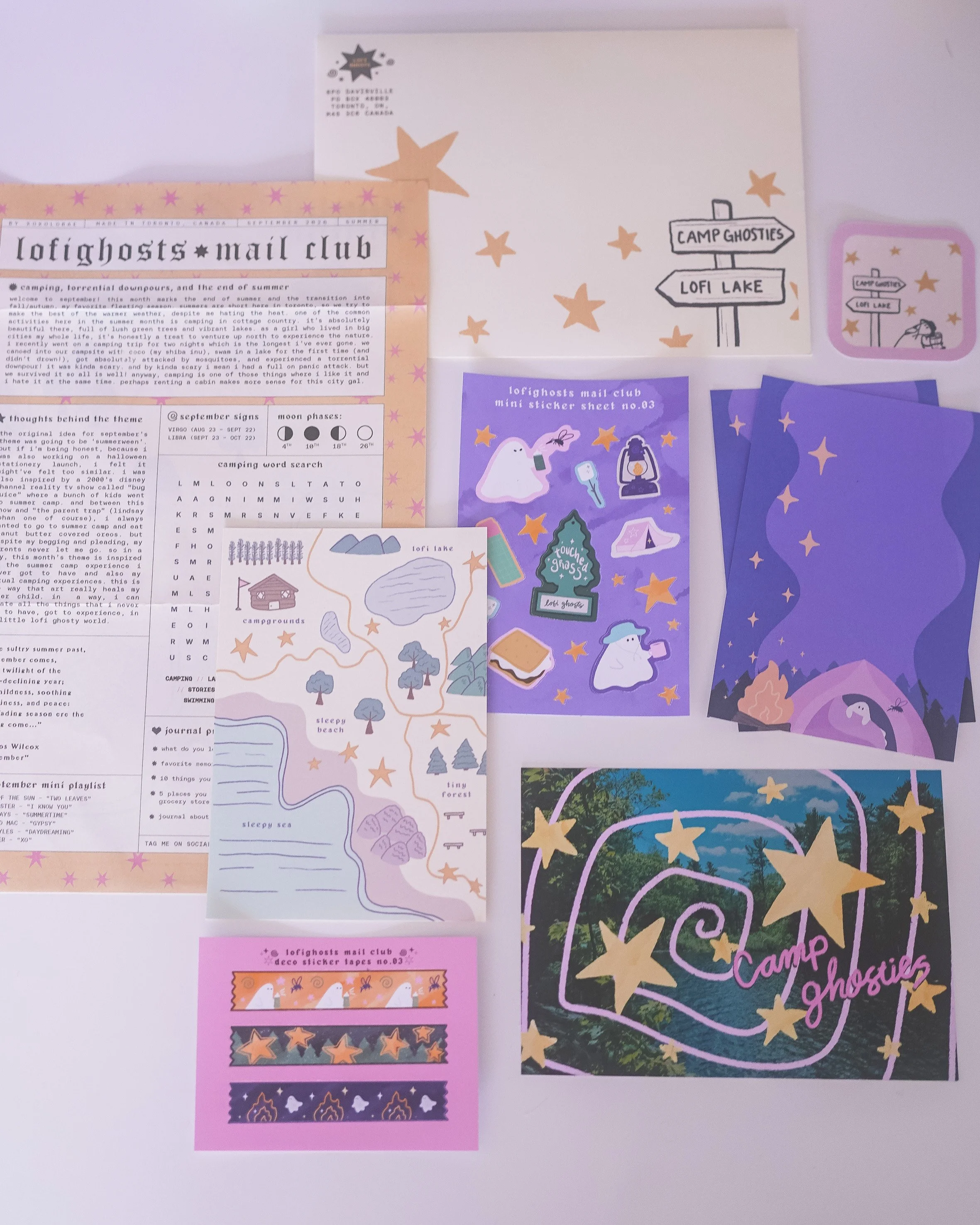
if you missed out on september’s letter, you can get the catch-up letter on my web shop
despite the trials and tribulations, i managed to successfully send out over 100 letters for september! i’m so grateful and thankful for all the support and for everyone who has shared their letters with me on social. if you’d like, you can tag me on Instagram or substack with your own spreads and show me how you used your letter goodies! it’s always such a joy to see my art in the real world, used by real people. it’s also why i’m continuously inspired to keep going each month. so thank you <3
in other news… i launched my first collection!
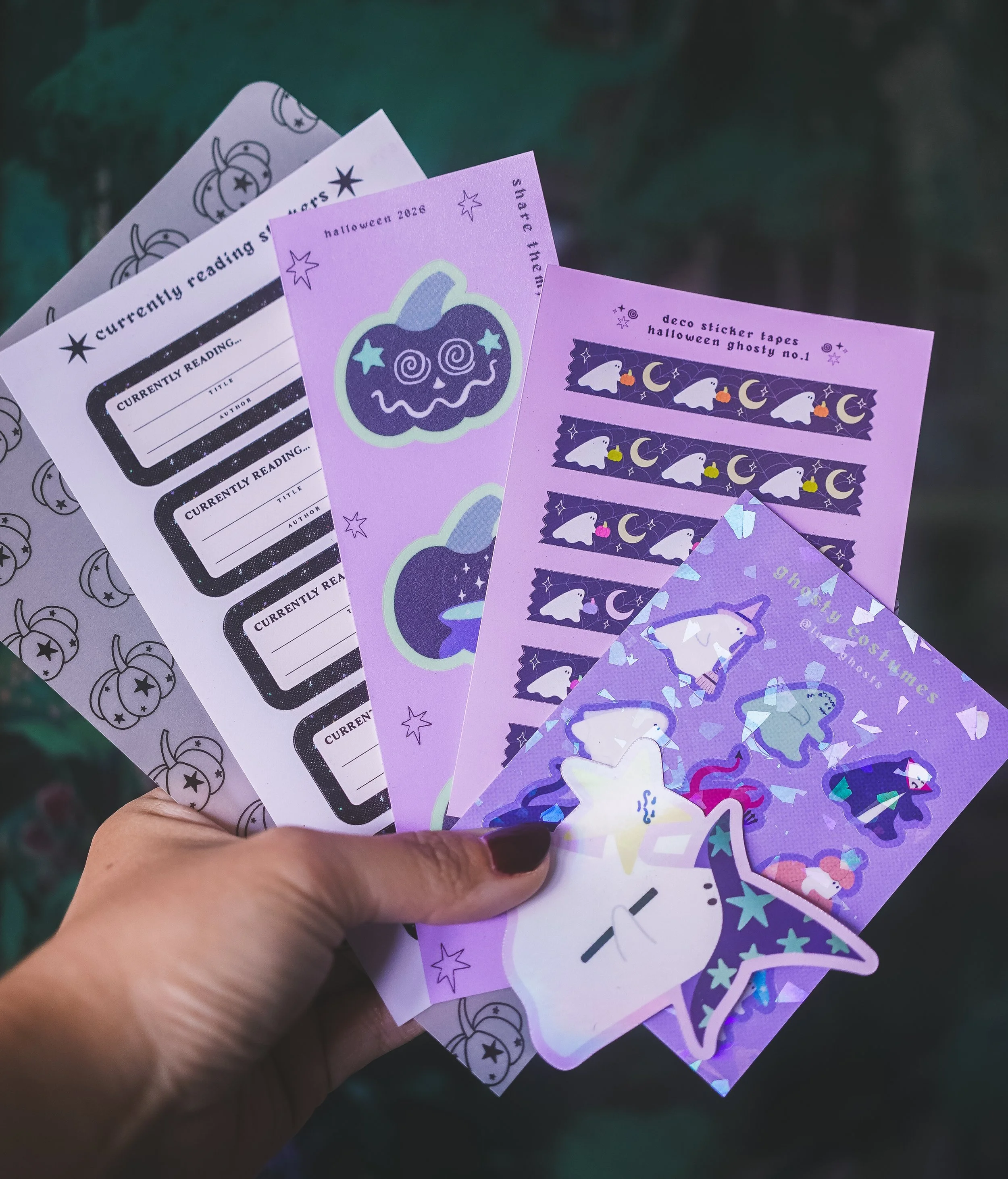
halloween is my favorite festive holiday and so it only felt appropriate to make my first stationery launch something halloween-related. it wasn’t a huge launch but i had so much fun designing all the stickers for this. there were also a few cozy / autumn and evergreen products that didn’t specifically have anything to do with halloween, because i just love this season in general.
i’m hoping to do these mini launches semi-regularly as it feels feasible for me. one thing about the word “launch” that always scared me as a small artist and business, is that it felt a bit overwhelming to prepare. i’m just a one-woman-show with chronic illness and adhd. how much could i realistically do in a small timeframe? but i’m actually proud of myself for pulling it off at all. and i hope you guys will really love this first small launch.
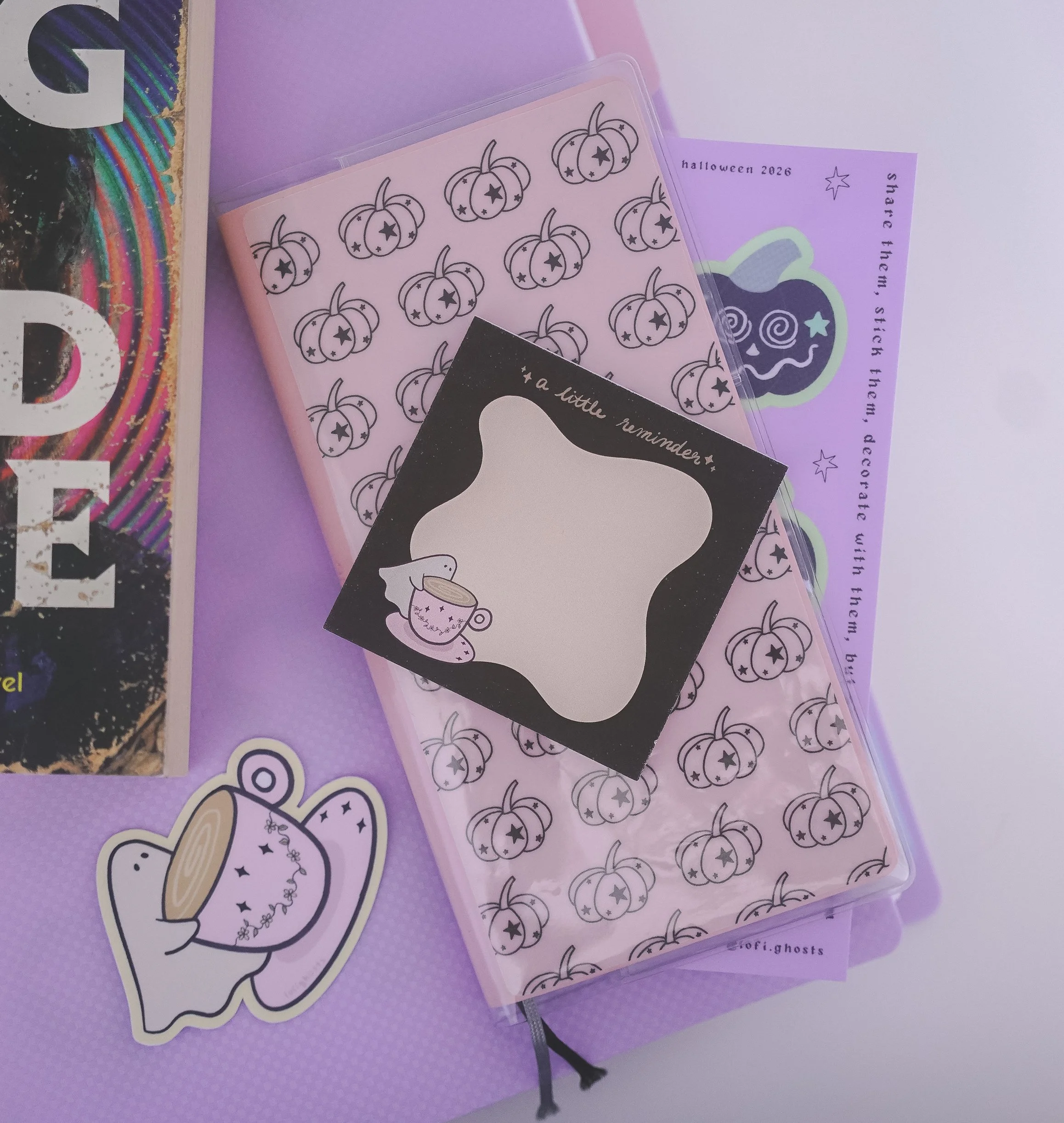
i also (finally) added the cafe ghosty sticker and notepads! this was my first attempt at launching something that wasn’t just a sticker or sticker sheet. pretty exciting! cafe ghosty was supposed to be its own mini launch if i’m being honest, but i didn’t quite make the september deadline i had given myself (because i may or may not have ordered the notepads a bit late, oops.) i added these along with the rest of the launch but it will become an evergreen product in my shop! i ordered a small quantity of the notepads because i could not make these at home as i’m not good at cutting straight lol. i’m hoping to add more to this line of stationery though because i love anything related to cafes and coffee.
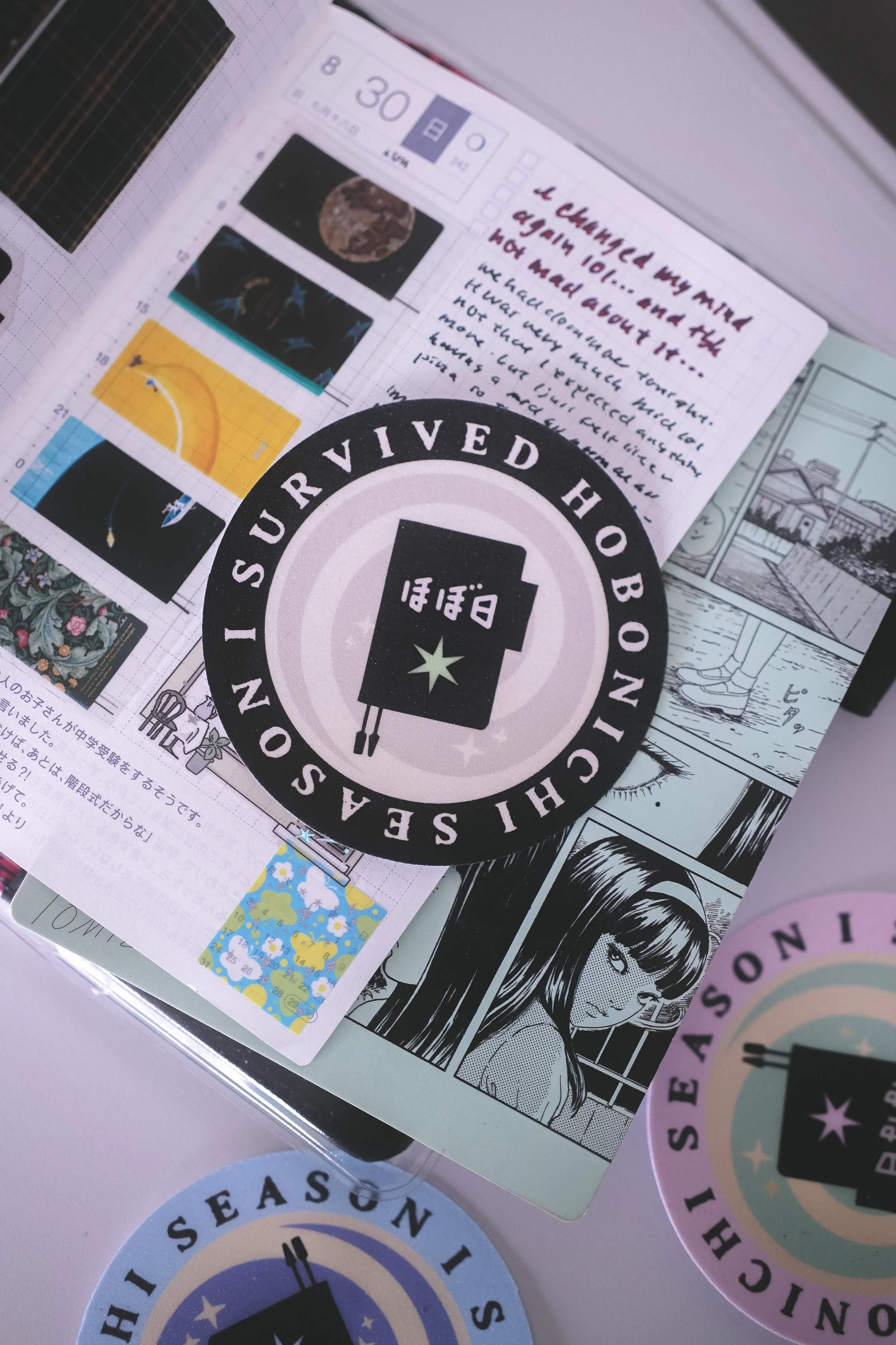
hobonichi season stickers available in the shop
last but certainly not the least, i created some hobonichi badge stickers for those who participated in the hobonichi launch! for those unfamiliar, hobonichi is a stationery and journal brand from japan. they are widely popular as an international brand and have launches for their yearly planners in september as well as another smaller launch in october, and then another one in the following spring. for many, this is a whole event! i am part of the many who participates in the launch. it can be a bit stressful due to how many people all over the world are trying to get their goodies. website crashes, long lines at brick and mortar locations, rare items and popular items that sell out quickly. and although it can be a bit chaotic, it’s one of the rare stationery events that generates this much hype. for me, it’s a mix of stress and genuine joy to be a part of it. anyway, it felt more than fitting to create some kind of sticker to commemorate the launch chaos, and so the “i survived hobonichi season” stickers were born.
that’s it for september’s monthly retrospective! thank you all again for being here and for the ongoing support for lofi-ghosts or xoxolorae if you’re more familiar with my yt and substack. for those who participated in the hobonichi launch, i hope you got everything you wanted. and if not, just remember, they will restock again this month! for everyone else who is also figuring out their systems for 2027, i hope you have a happy planner season!
may october bring in crisp, cool air, pumpkin-lined doorsteps, and a spooktacular time of year.
take care friends~
xoxo,
lora