monthly retrospective: august mail club letters
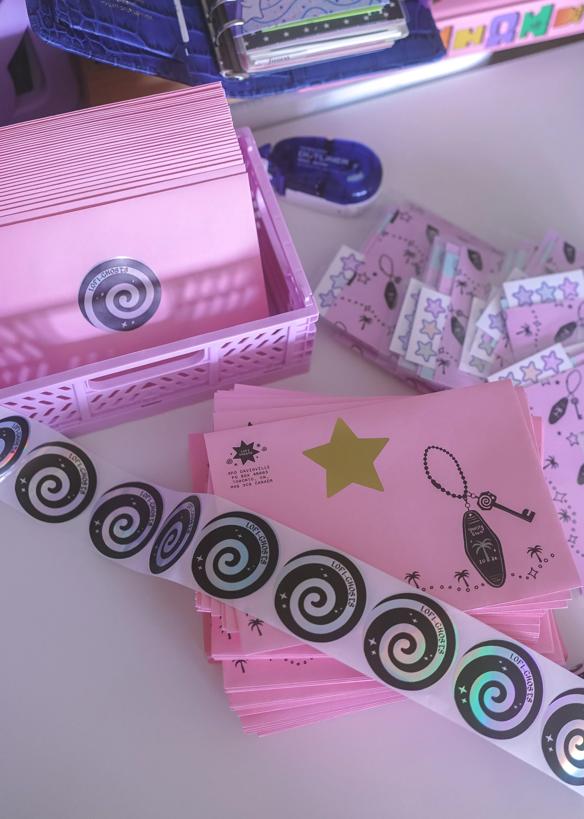
hi friends~
i hope august treated you all well. cannot believe it’s already september, which means we’re quickly transitioning from summer into cozy season!
hopefully by now, you’ve received your august letters (if you still haven’t, please email me!). now that all the letters are sent out, i wanted to talk a little bit about my thoughts behind the theme and what the second month of my mail club taught me (a lot tbh).
if you know me at all, you’ll really understand why i loved designing the august stationery goodies. it was the perfect chance to make everything pink, pastel, and sort of nostalgic. and although i want to stick to my brand in terms of what kind of color or art style i use, i don’t always feel like it’s on theme to use pinks and pastels in my color palette. for my first letter in july, i ultimately chose a blue color palette because it was more fitting to the nautical, fireworks theme. but working on august’s letter made me realize just how much joy i get out of making everything pastel and pink!
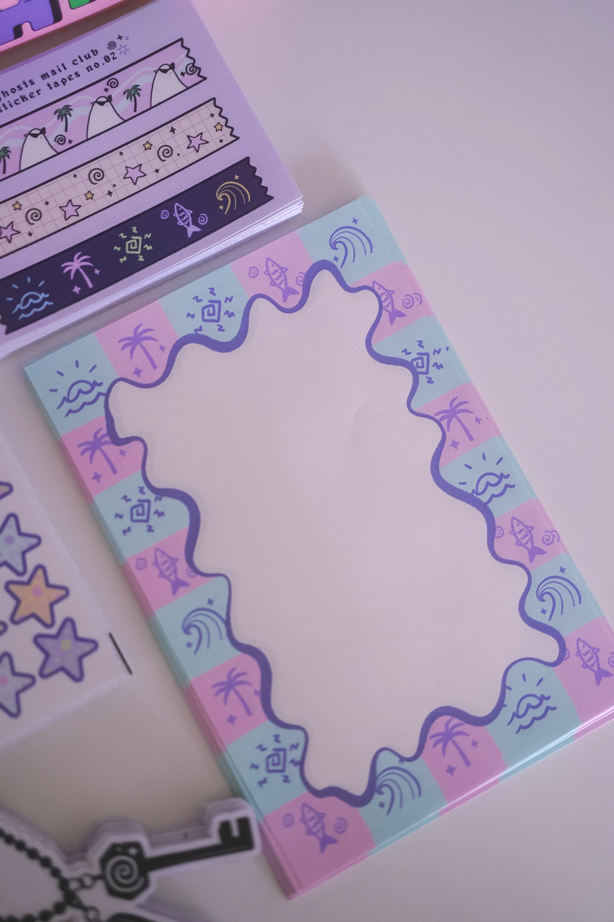
august’s notepad design using tomoe river paper!
it may not be everyone’s cup of tea, which i totally understand, but i think the balance for me is figuring out how to incorporate the colors and the aesthetics that feel branded to lofi-ghosts, while also being considerate of that month’s theme. after all, it is a monthly mail club. and i think it might be boring to have the same colors in every single month (well, for some anyway, not for me lol).
i also tried a few different things for my second letter. i think the best part of producing everything at home is that i get to experiment as much as i want! and i had a big pack of tomoe river paper that i didn’t really feel like i would use for anything else, so i decided to try it out for the mail club. honestly, i thought the stationery and journaling community would love the fact that it’s TRP (iykyk) but i also think the paper is a little too thin. i also don’t feel that it’s a feasible option moving forward with. but it was fun trying it out and at least i got to experiment with it for a month. september will include two notepad sheets but on regular printer paper. personally, i felt like if i were to receive notepad papers, i’d want at least two, so that’s why i decided to put two in for september!
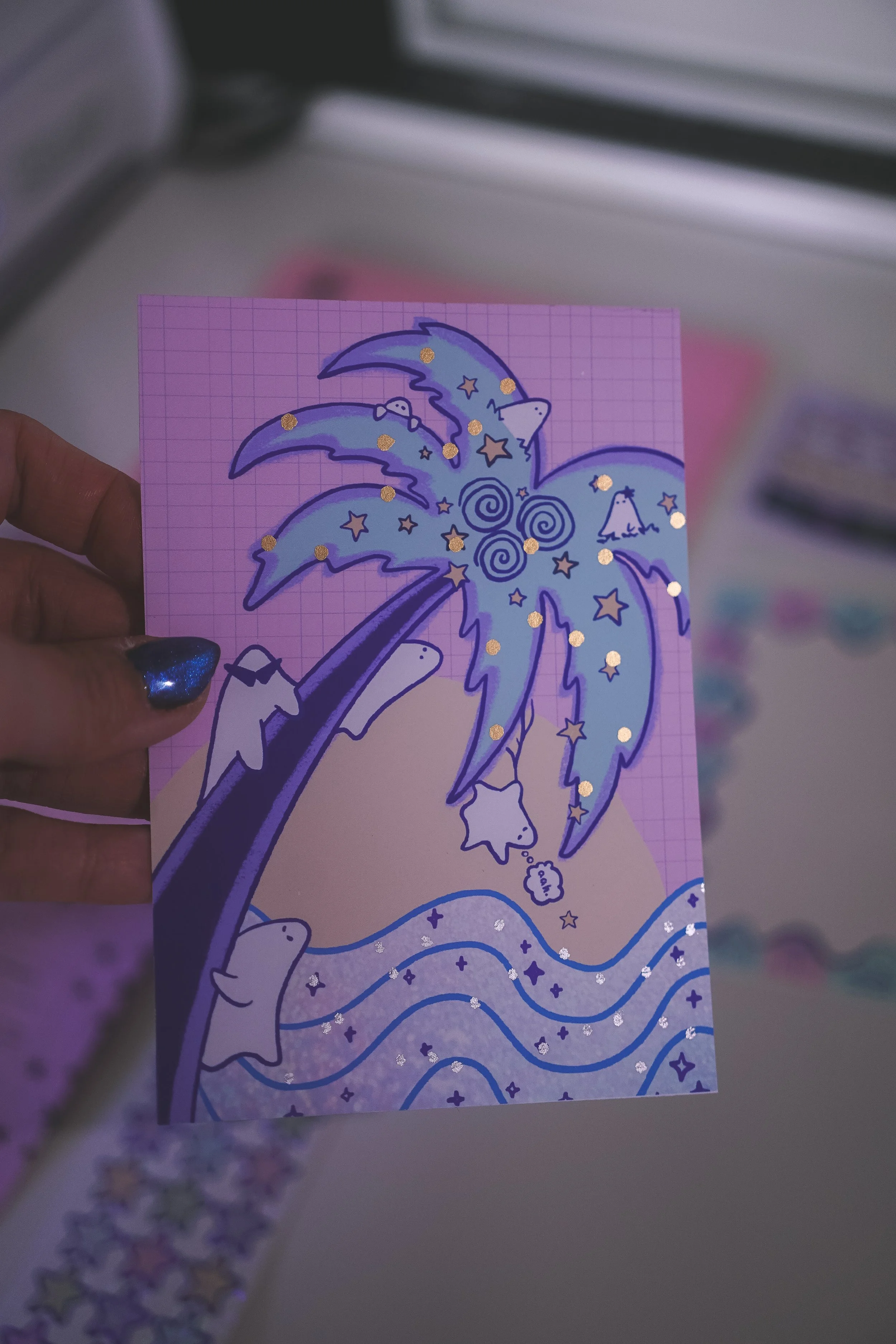
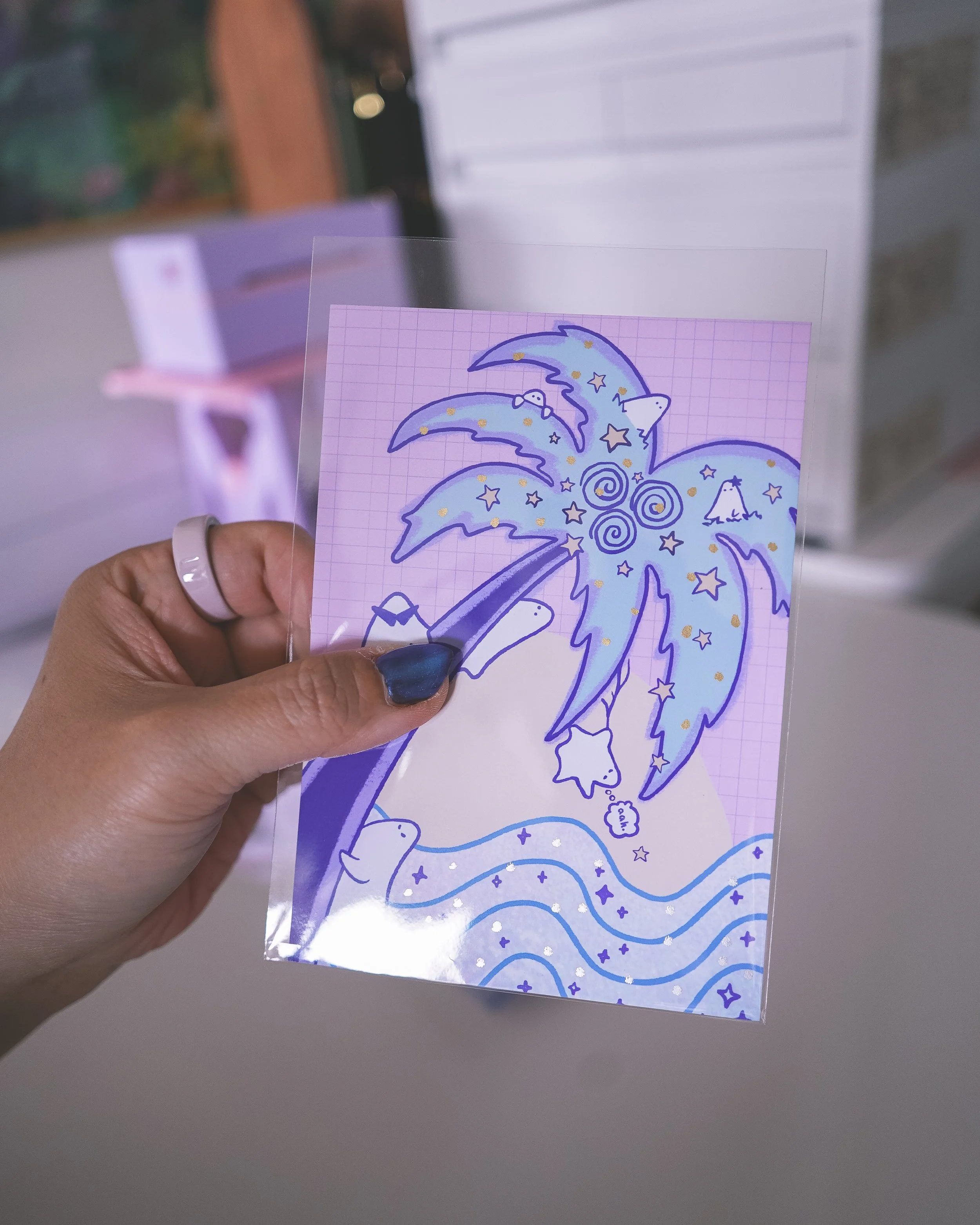
i vowed to not make the same mistake twice. so for july’s letter, i thought it would be cool to hand-foil some little sparkle effects on the art print. but i made the costly mistake of not considering the heat and how some letters would be sitting in hot mail trucks and mailboxes. so there were, unfortunately, some smudging issues happening. for august, i decided to do it again (because i love being difficult…and i wanted redemption) and this time, i added little plastic sleeves so that it would hopefully, alleviate the smearing issues. so far, the feedback has been positive! it’s another little added cost to the mail club but i think it’s worth it to protect the art prints.
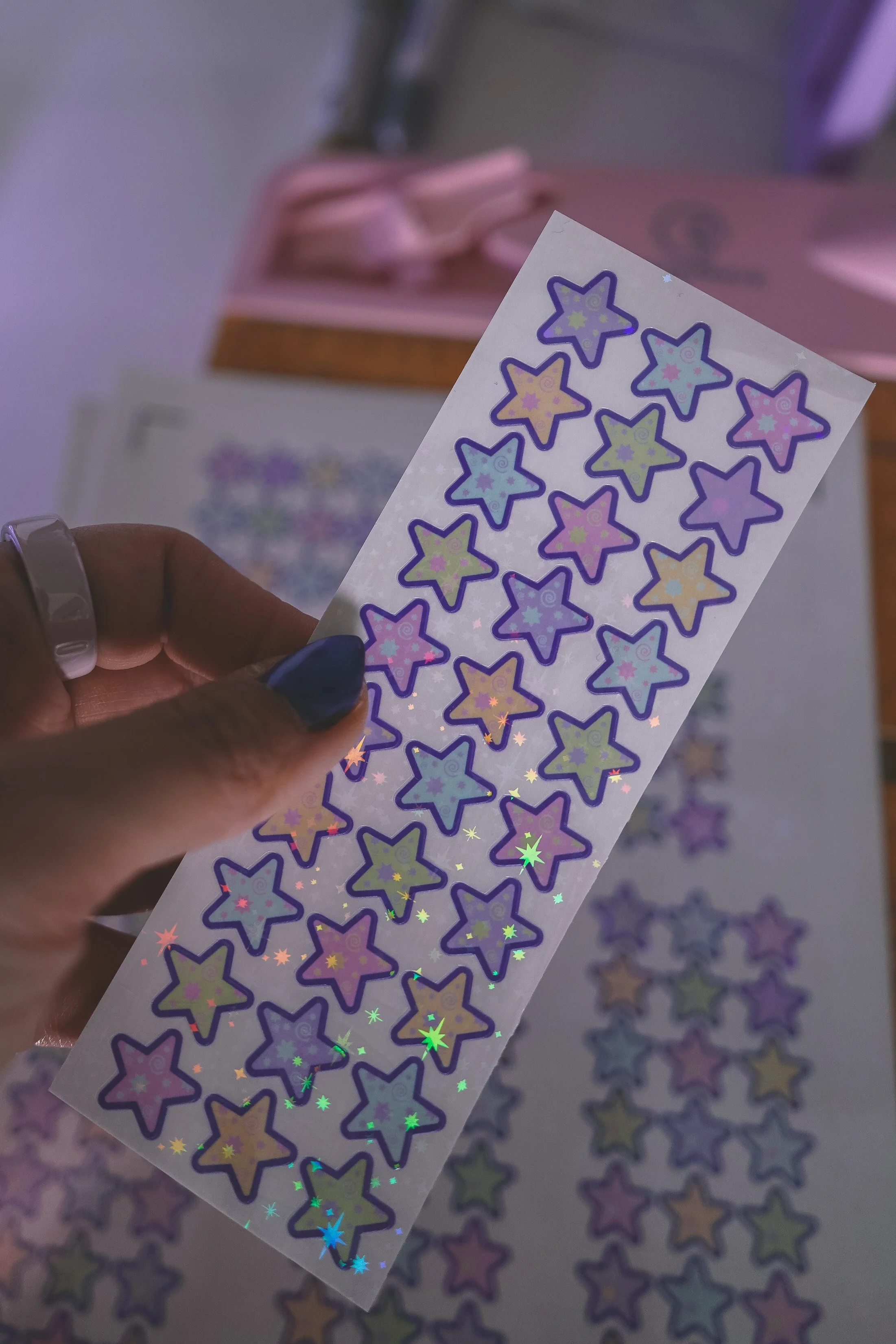
the sticker sheet for august were these sparkly mini star stickers! i thought i’d switch it up from the character design stickers and create a full sheet that could be used for planners as well as decorative journaling. i’m a sucker for anything with star graphics, so you’ll naturally see a lot of that in all of my designs. there are also tiny little details within the stars that may be hard to see because of the bright colors, but i liked having an option for a sticker sheet that could be used to mark monthly calendars or weekly planners.
i think the general feedback is that most people still prefer the character stickers as there are more variations. but many of you also reached out to tell me you liked the star sticker sheet the most! so maybe moving forward, i can figure out a way to incorporate a little mix of both. feel free to let me know in the comments if you have a preference of character stickers or repeated pattern stickers like this, which make it easier to use for planning. i also find that repeated pattern sticker sheets are easier to actually use, because you don’t have to be too precious with it.
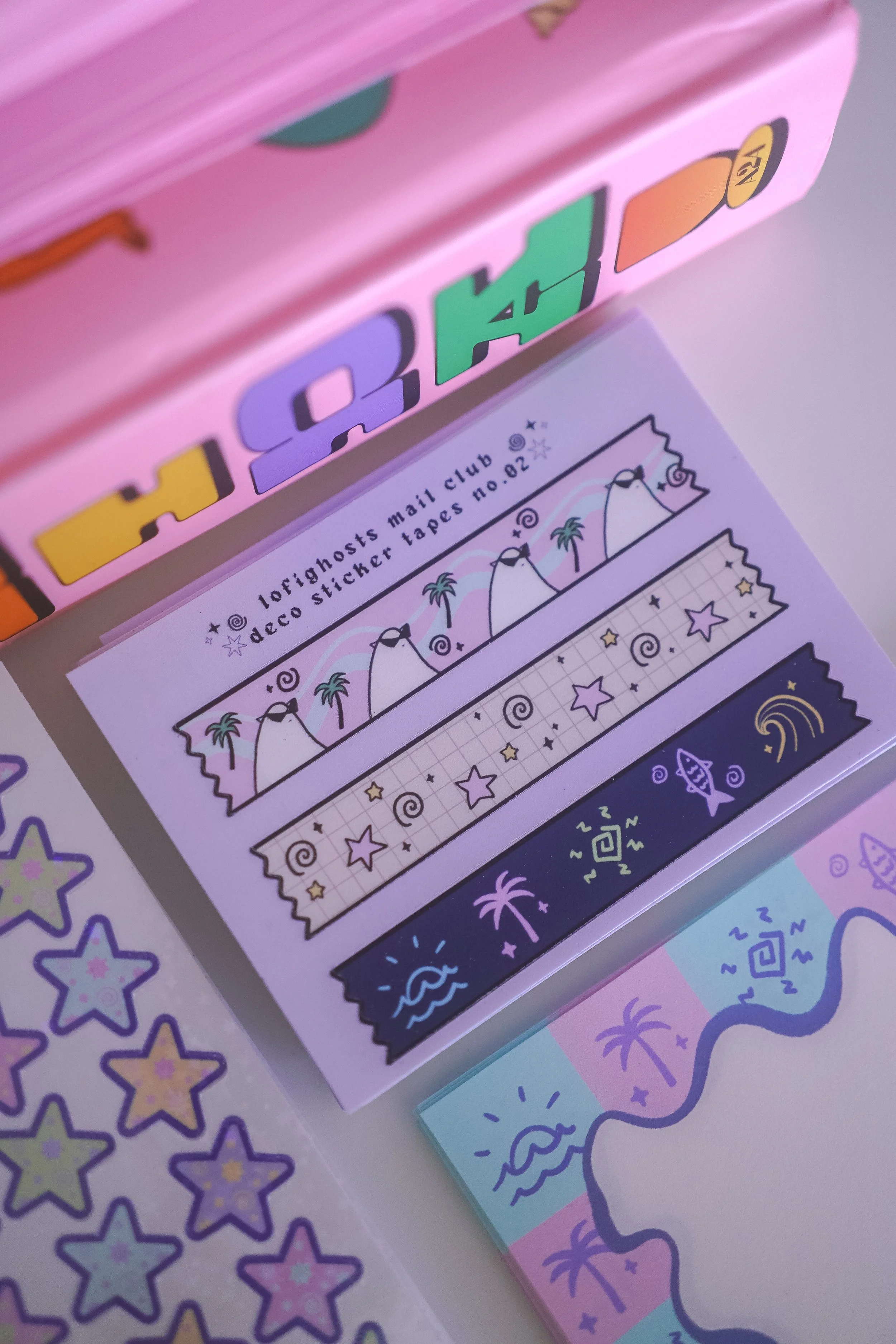
my personal fav item in august’s letter was the deco tape stickers! i just love these things because they’re so versatile. i’ve used them to close my chip bags lol. but they’re also great as letter seals if you have penpals and can also be used to seal a small gift wrap. because of its versatility (and is also a fan fav) i’ve decided that this is the one constant in all the letters. i really loved how the designs came out here. the soft muted purples and the 80’s miami pinks and aqua blue just scratches an itch in my brain.
i just had a blast designing august’s letter and i was definitely inspired by the whole 80’s miami / los angeles aesthetic. i hope you all enjoyed the little pop of color and summer vibes in your mailbox.
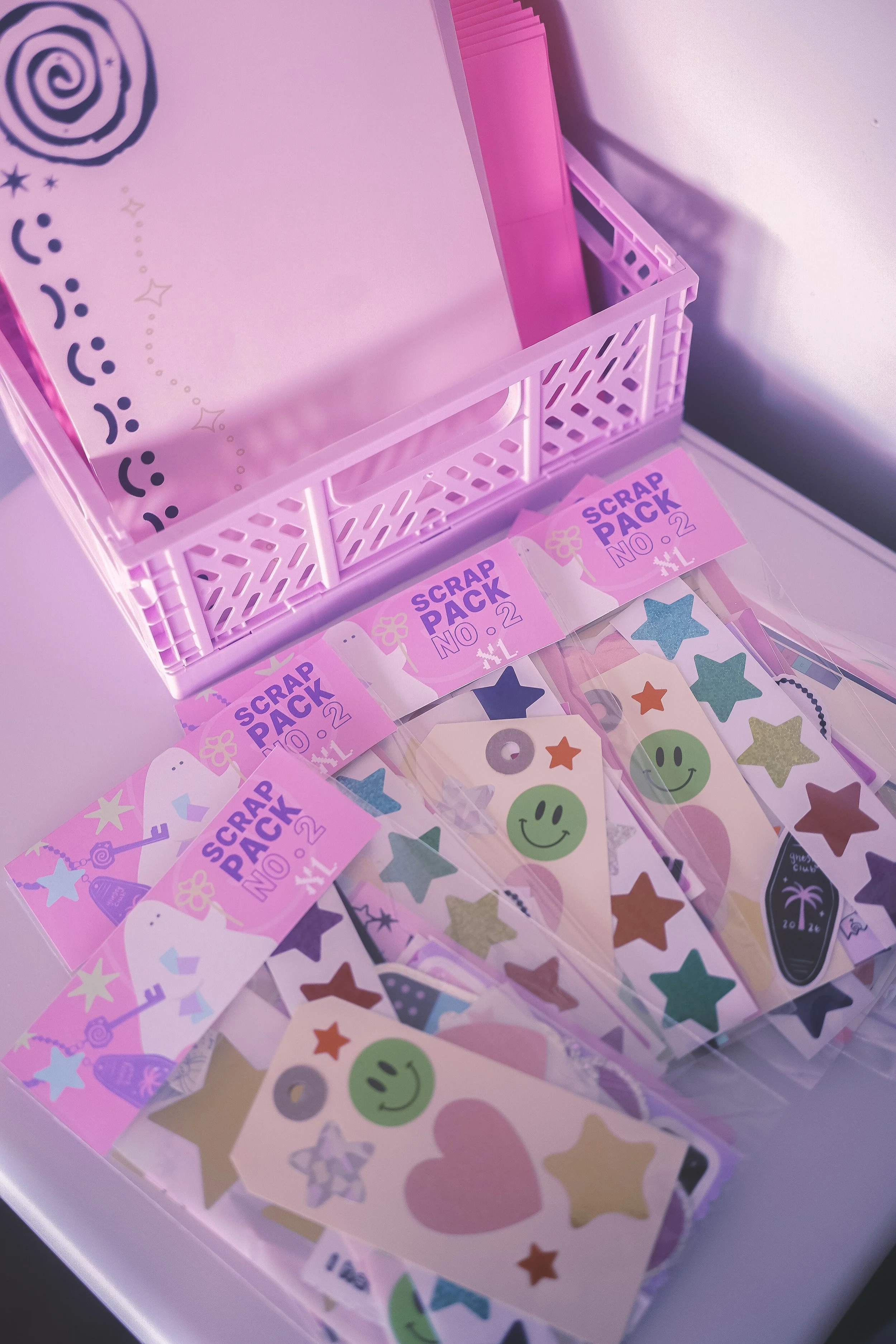
scrap packs no.2!
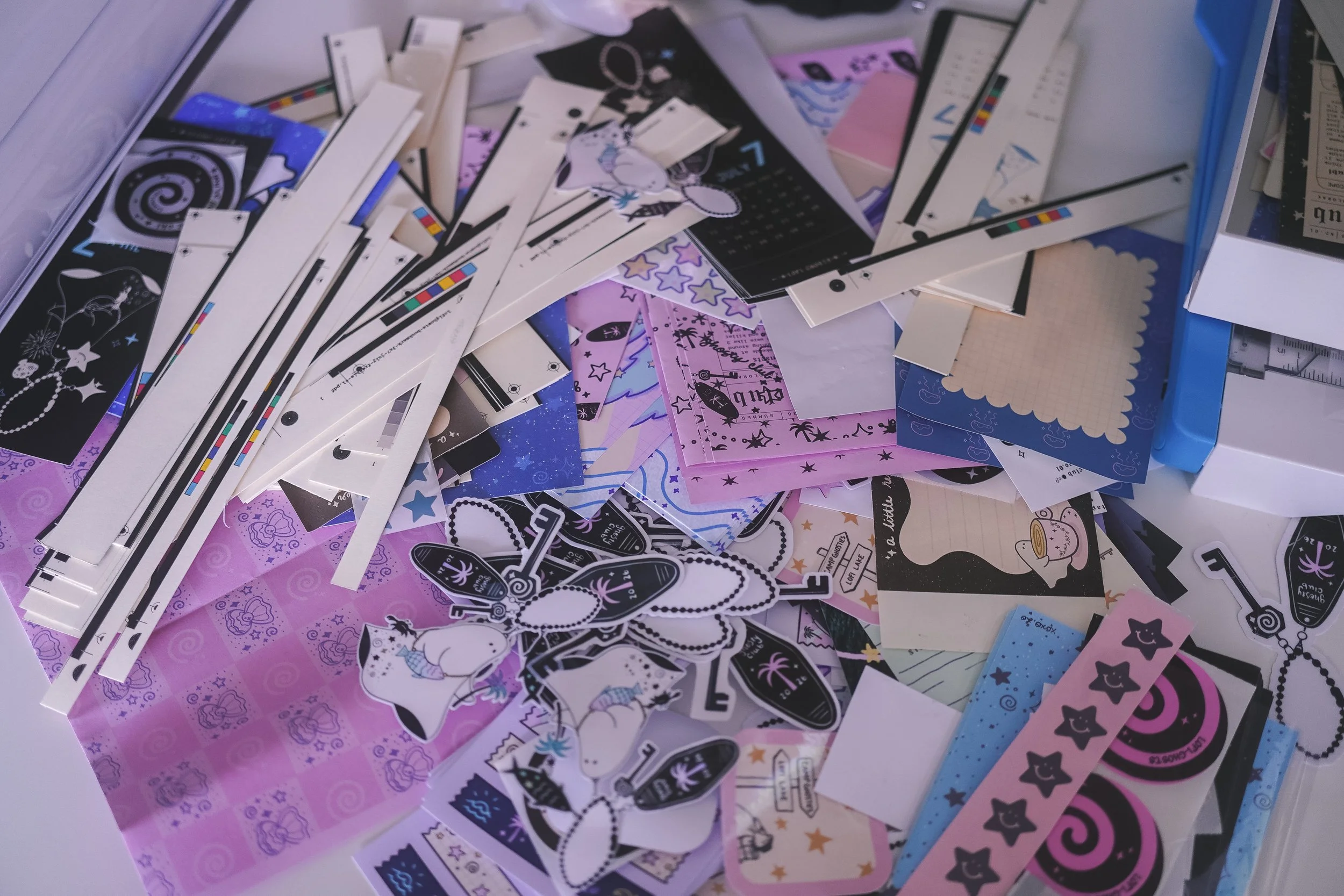
when i started the mail club, i had a lot of paper waste. i think it’s just a natural part of producing and making stationery at home. i have to cut down all of the prints and stickers so that they’re to size. and that often means having a lot of colorful paper leftover. i felt like some of the papers just felt too pretty to throw away, even though technically it was just trash. but you know what they say — one’s man’s trash…
so i came up with journal scrap packs that incorporated some b or c-grade stickers and sticker sheets, colorful paper bits that could be used to junk journal, and also a collection of stickers from my own collection! i didn’t want to just sell a bunch of scrap papers, so even though it’s called a “scrap pack”, it’s really a sticker pack that’s curated by me. i think each month i want to offer these scrap packs. in a way, it helps me circulate some of the pretty paper bits and bobs and also gives me an excuse to put together cute sticker packs for you guys at a relatively low cost.
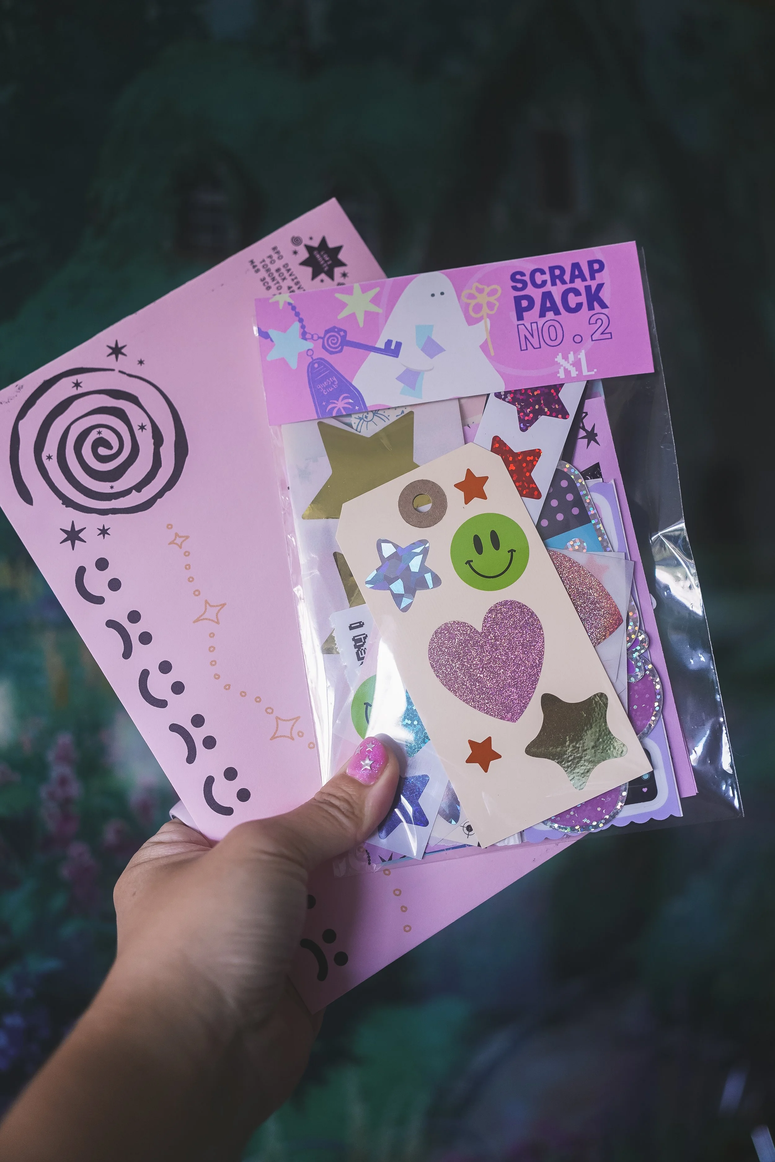
also, this time around i made two different sizes. one regular envelope filled with stuff and a bigger, “XL” envelope! and tbh, i was surprised how well the xl ones sold! they are a little more expensive for me to produce but they came out so cute! i also added some of the stickers from my old art brand “loraemonster”, which i think are still pretty rad and were actually really costly to manufacture since they were glittery and holographic stickers.
truth be told, with these, i’m not really making much profit on them. and i stayed up all night putting them together because i’m picky about how i curate things lol. i don’t charge a sales tax because i add the tax into the cost. so really, the scrap packs are kind of my way of giving back / circulating my stationery with you guys in the community and a labor of love. i really hope i can continue to make these each month! at the end of the day, i want everyone to be able to enjoy having stationery and have fun with your journals without breaking the bank.
if you’d like to grab a scrap pack, you can get them here!
that’s it for this month’s mail club retrospective! september’s letters are going into production this week and will be shipping by next week!
if you want more regular updates on mail club news, reveals, and new stationery things, please consider following me on instagram! it’s way easier for me to do regular updates there.
i’m also no longer going to post spoilers or reveals on the blog here. and that’s mainly because i already do that on my socials. but also, i know a few members like the idea of having a surprise in their mailbox each month. i find that really adorable lol and i want to respect that! so with the newsletters here, it will mostly be any important updates and retrospectives, as well as the occasional work-in-progress and art posts.
i hope september will treat you all well.
take care friends~
xoxo,
lora